Mobile Bench gadget store
Development of brand – design and graphic elements that form the visual image of the company
Since this brand is niche, regional and tied to the personalities of charismatic owners, our branding specialists decided to build the brand image in synergy with the personal qualities of the owners. This decision also made it possible to rebuild the visual image of the brand from tech giants.
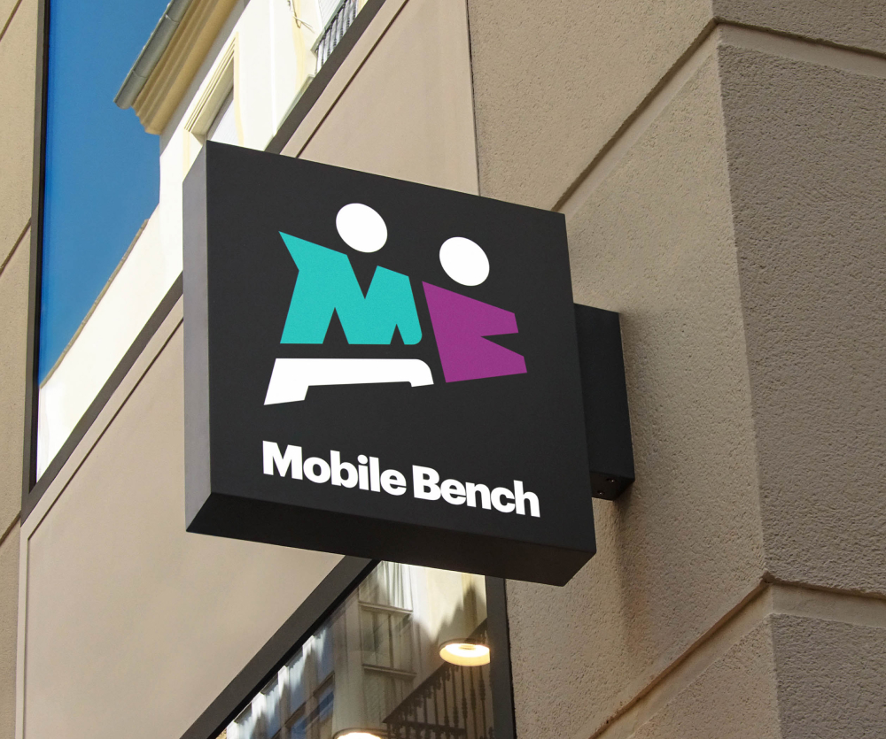
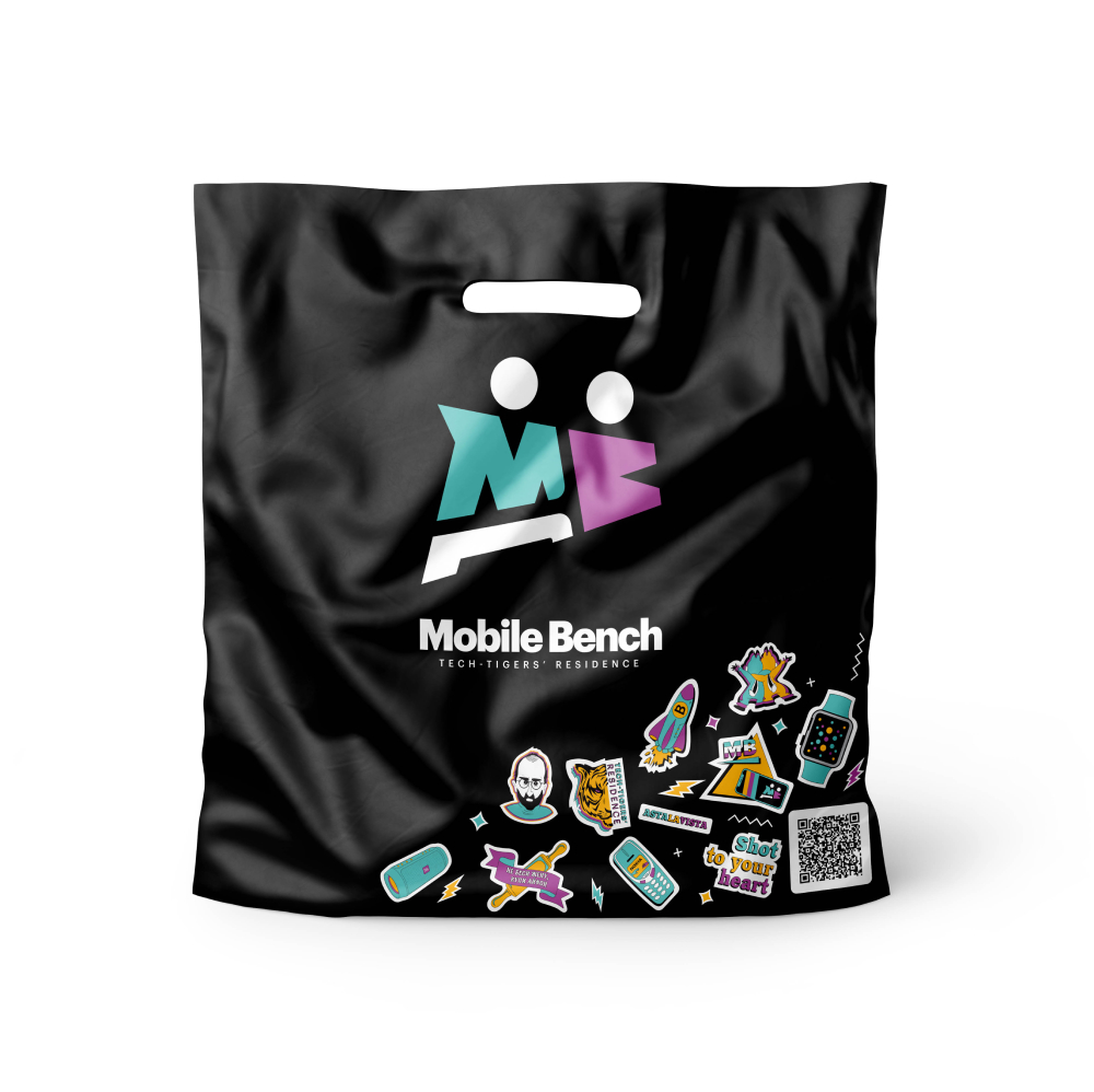
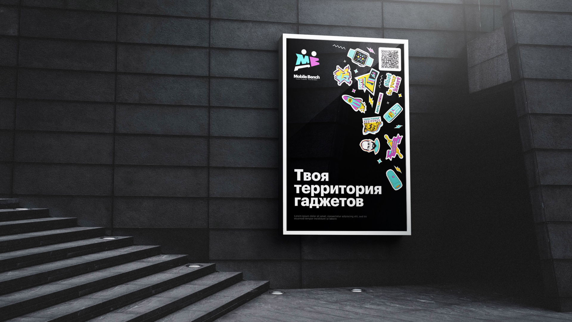
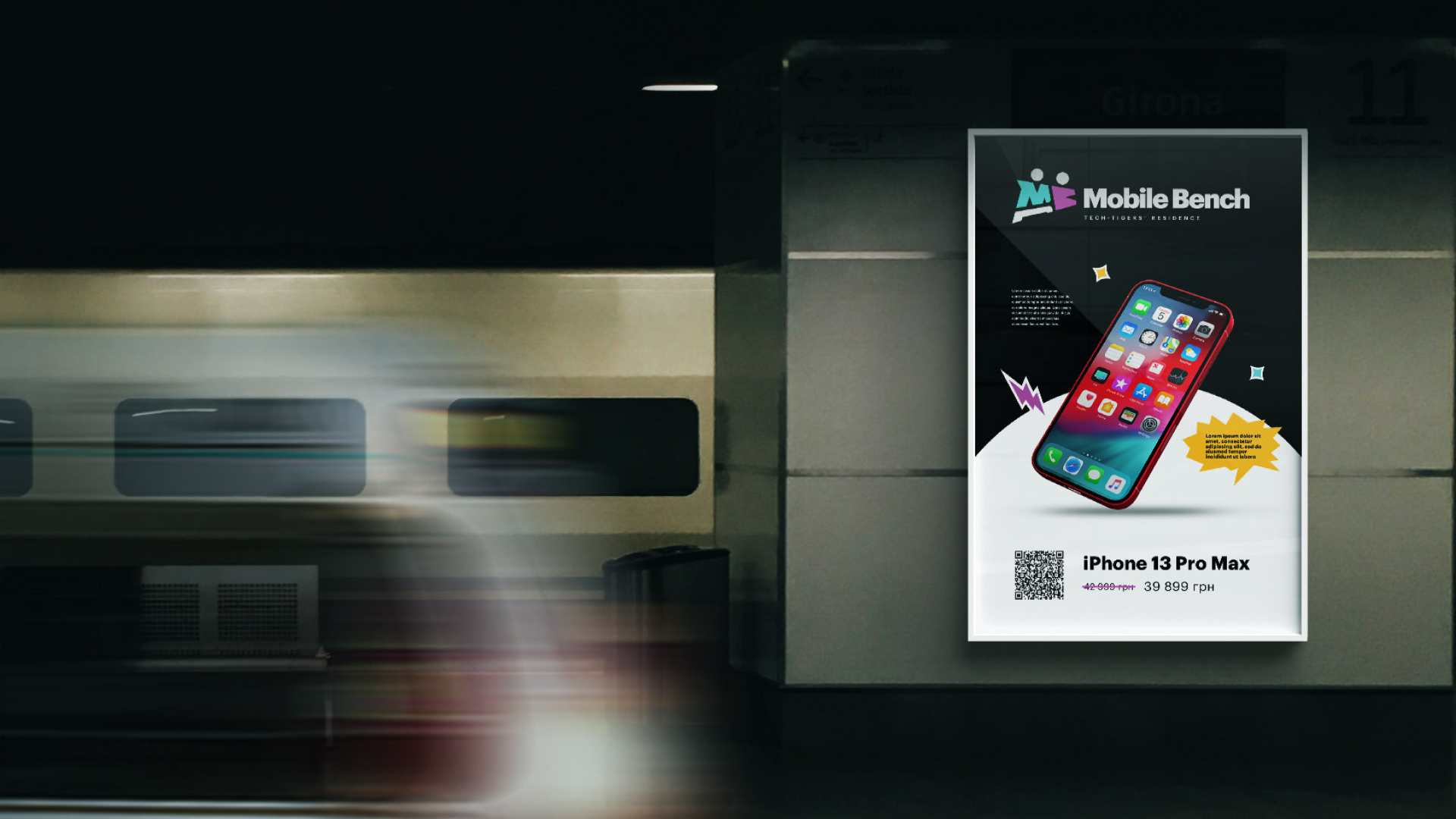
A dynamic logo with an inherent meaning was developed (a silhouette of two brothers, an abbreviation of the brand name and a shop as an attribute)
No strictness and restraint – Mobile Bench is bright, juicy and very modern!
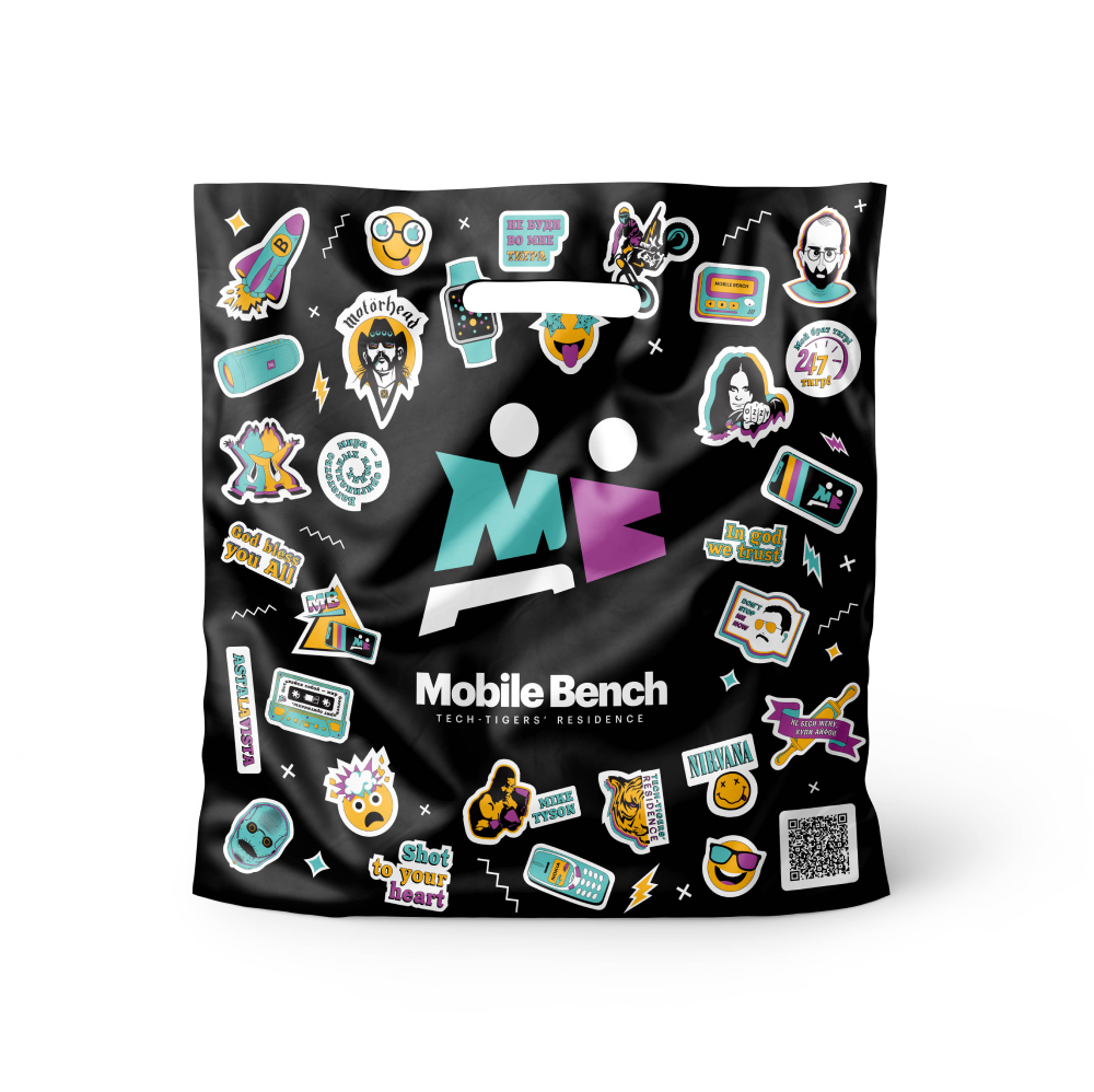
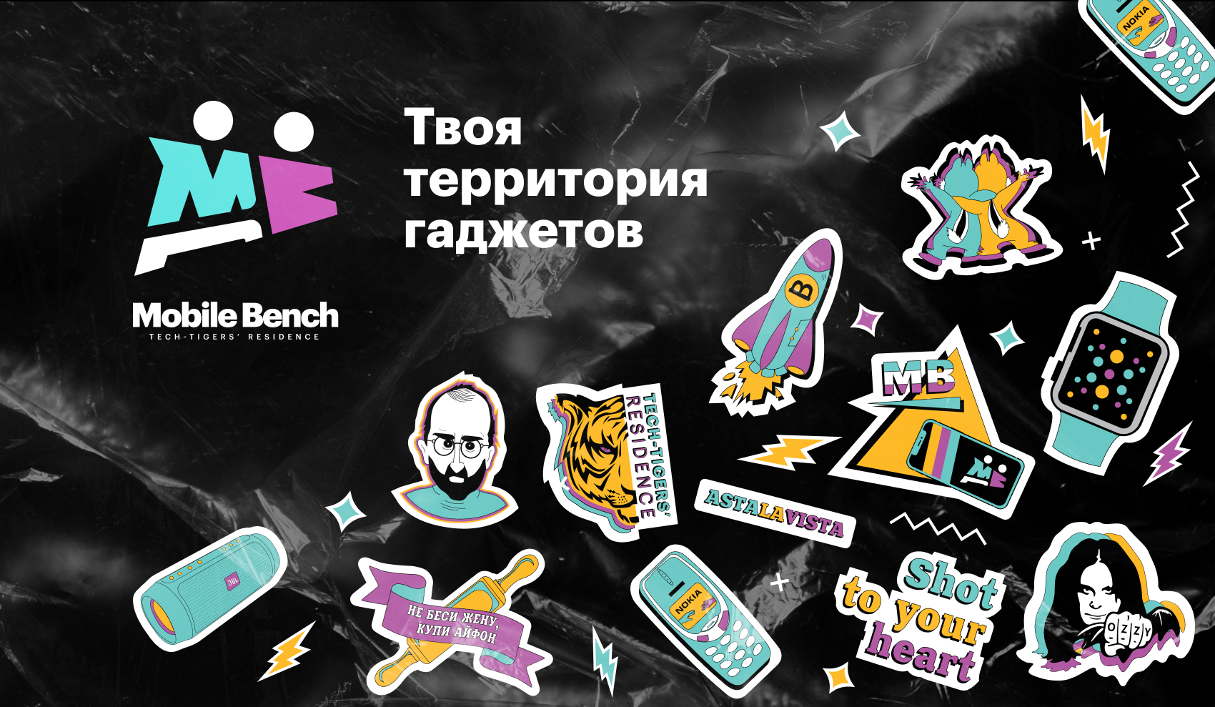
To add wit to the look, sticker sets were developed that made the look of the company bolder and more consumer friendly. Bright color combinations are used, and the illustrations look like a medium-drawn flat drawing, combined with colorful abstract figures.
Key elements of corporate identity:
- logo
- corporate colors
- fonts
- attributes
- illustrations