Fenix Recovery
development of a brand book
Fenix Recovery
Rehabilitation center
TASK:
development of a brand book
DECISION:
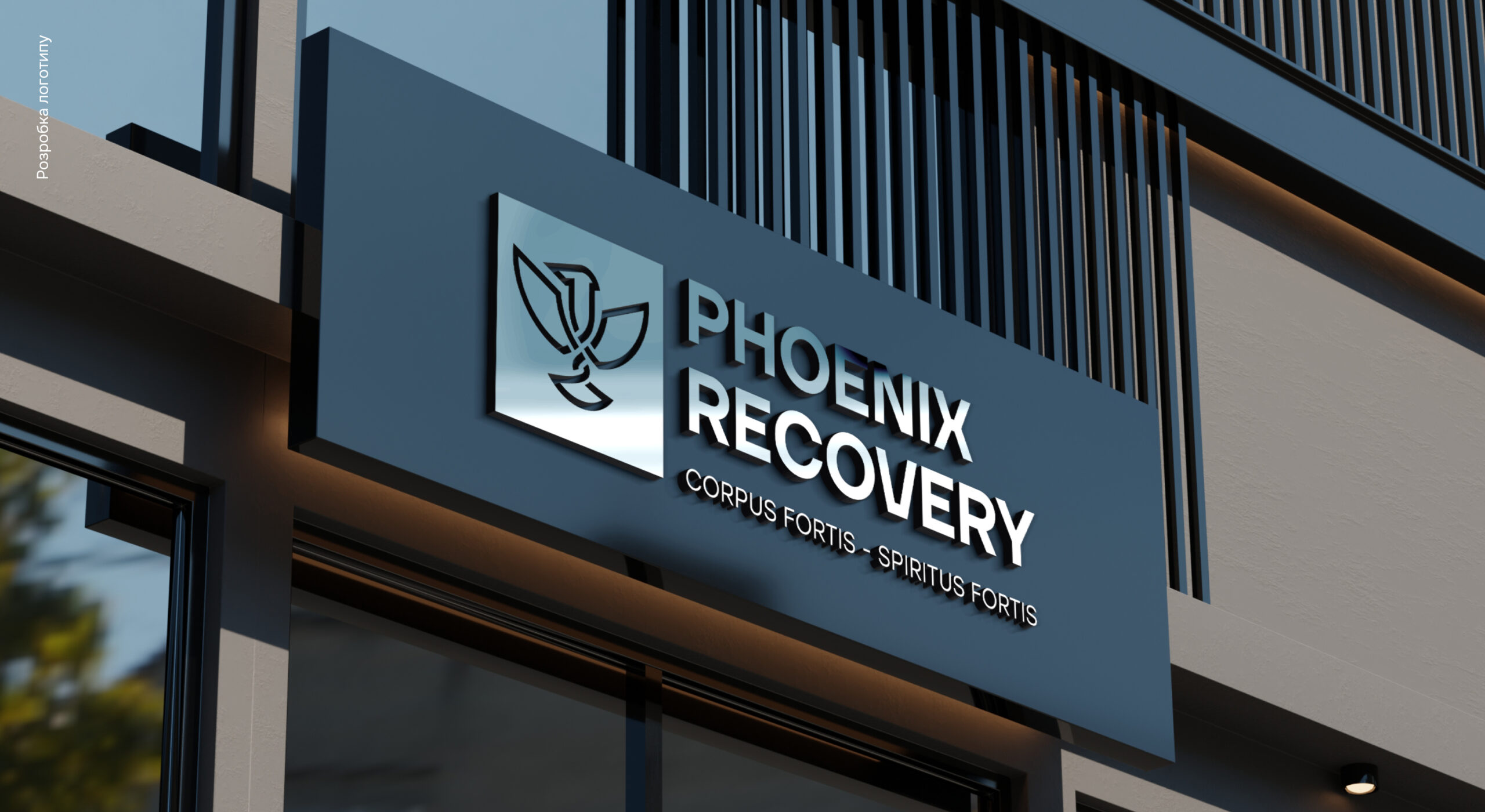
While creating the logo and shaping the style of the project, we tried to combine meaning and modernity, association and content, the classic direction of our client’s activity and the creative thinking of our team.
The main element is a bird with upward-pointing wings.
Because recovery is exactly the upward movement.
Also, the wings subconsciously refer to the coat of arms of Ukraine.
And this is very powerful, considering that our customer is engaged in the rehabilitation of our brave soldiers.
Additional elements strengthened the idea and gave nuances