Educational institution branding, character creation, 3d modeling
The goal of our creative team was to create an image that reflects such brand characteristics as: invincibility, brightness, will, diligence.
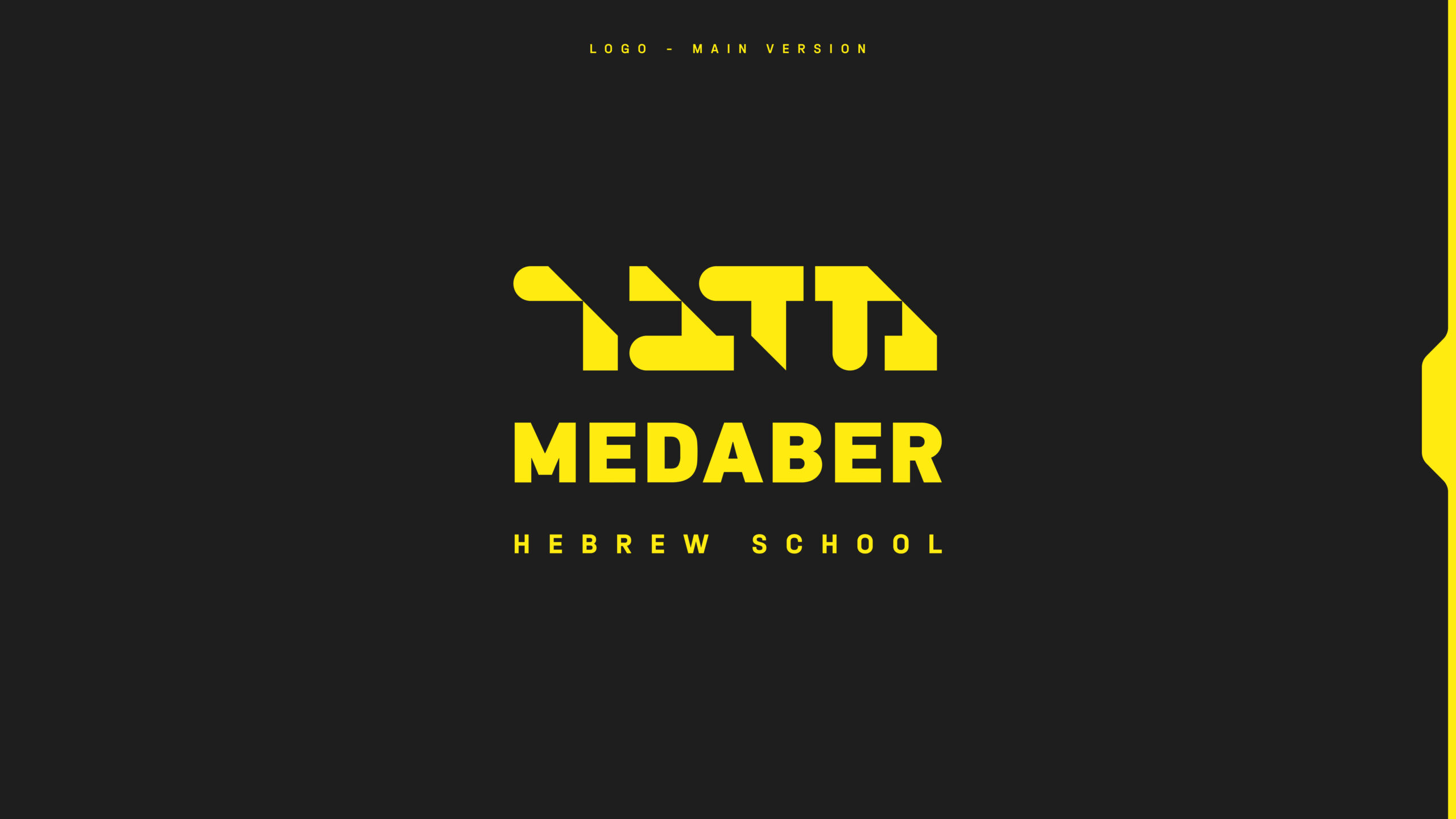
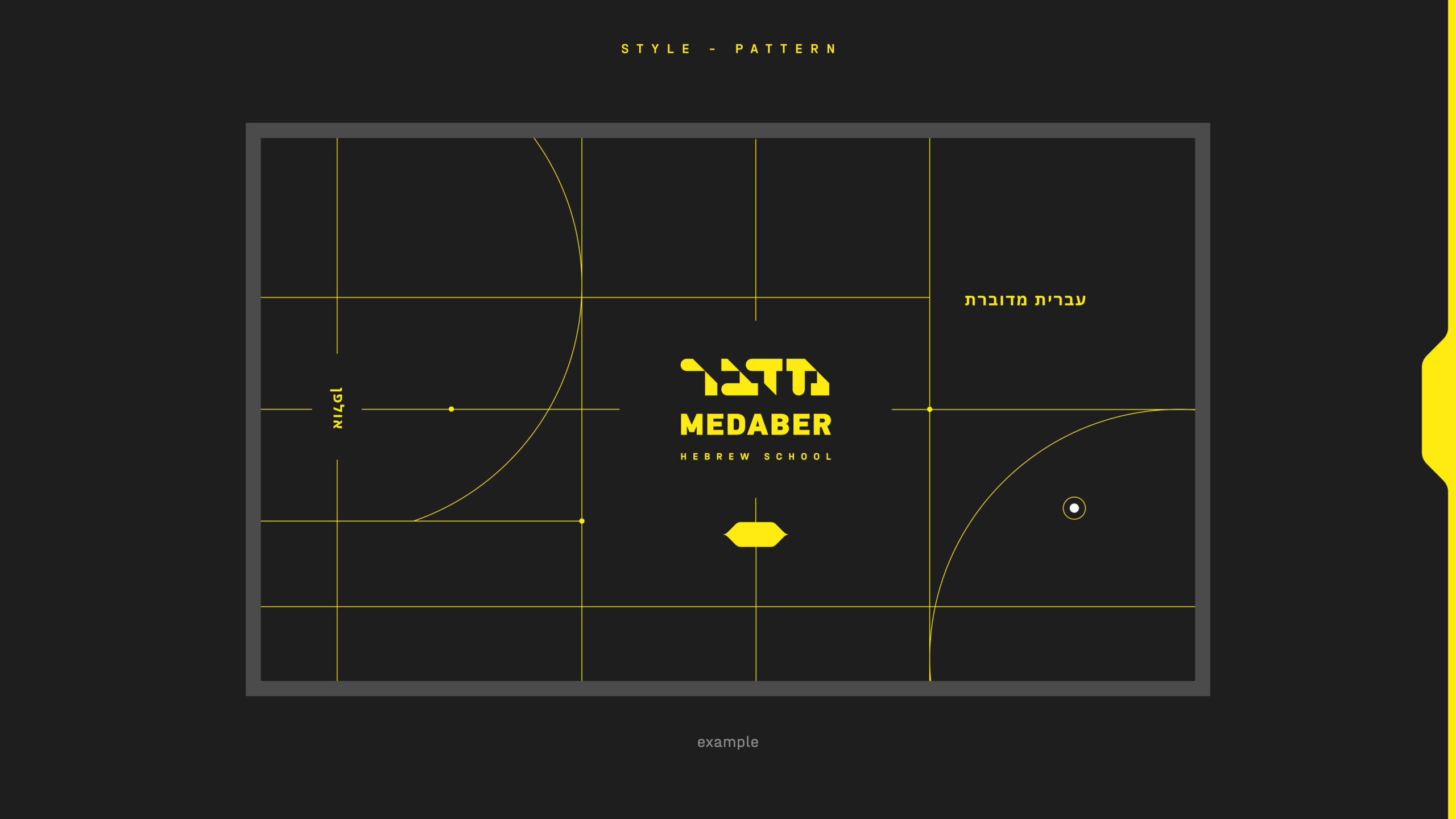
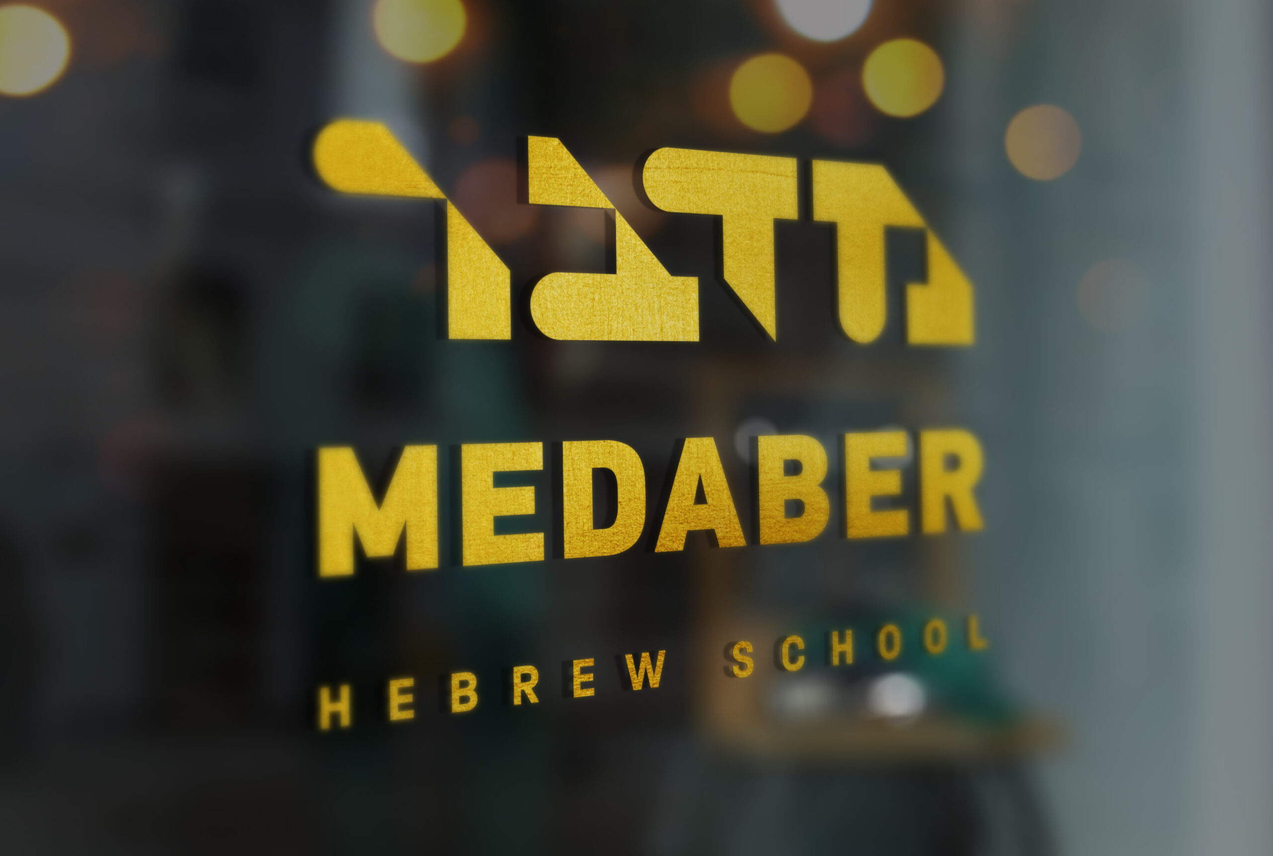
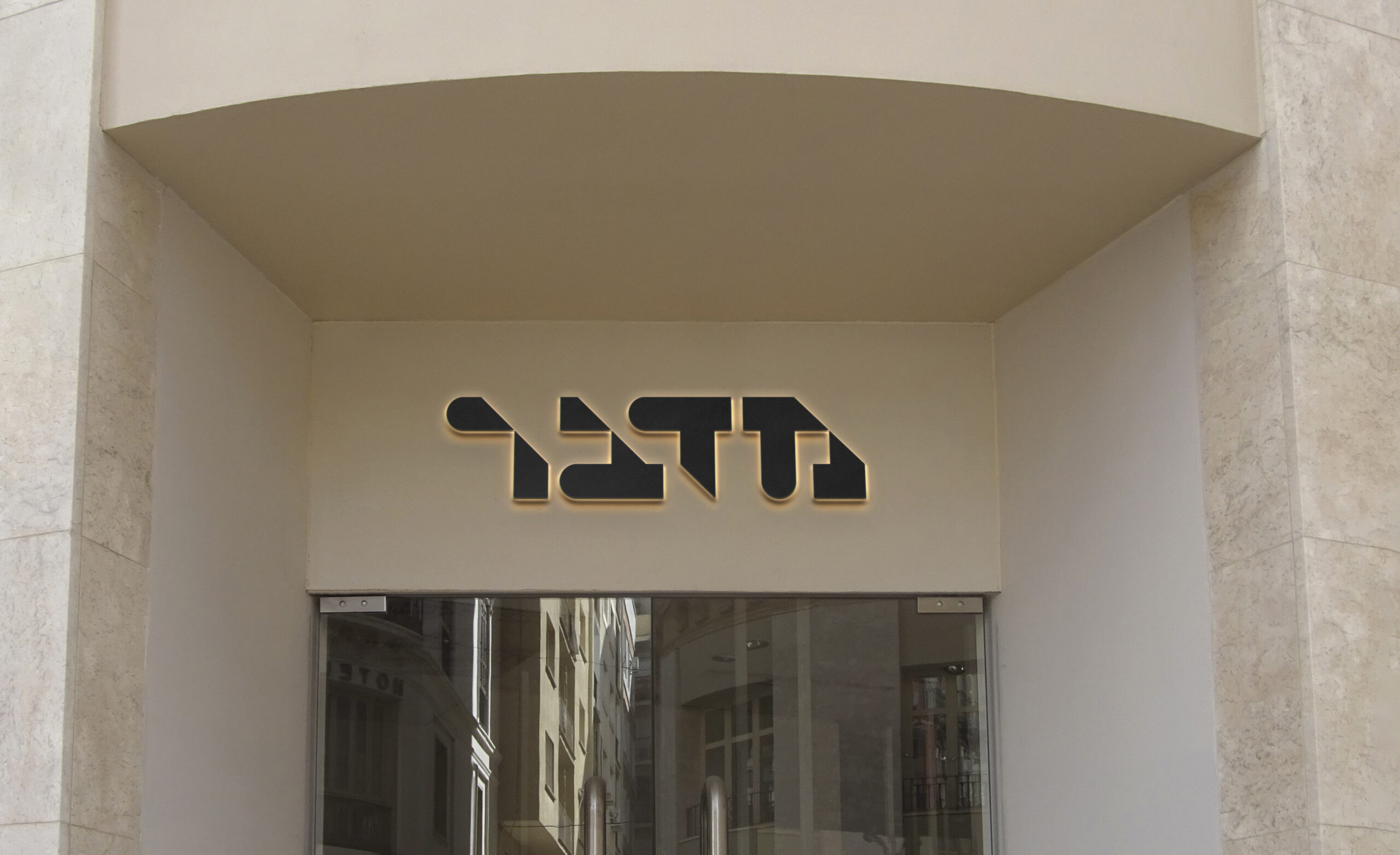
At the first stage, the creative department of our team developed a sign in a typographic style, the basis of which is a font that helps to focus only on the company name
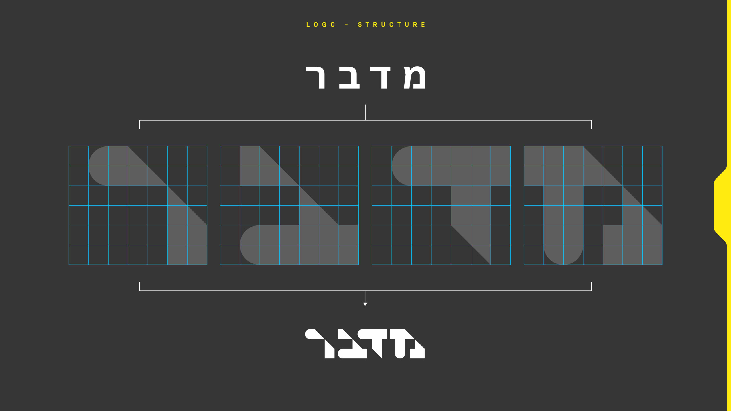
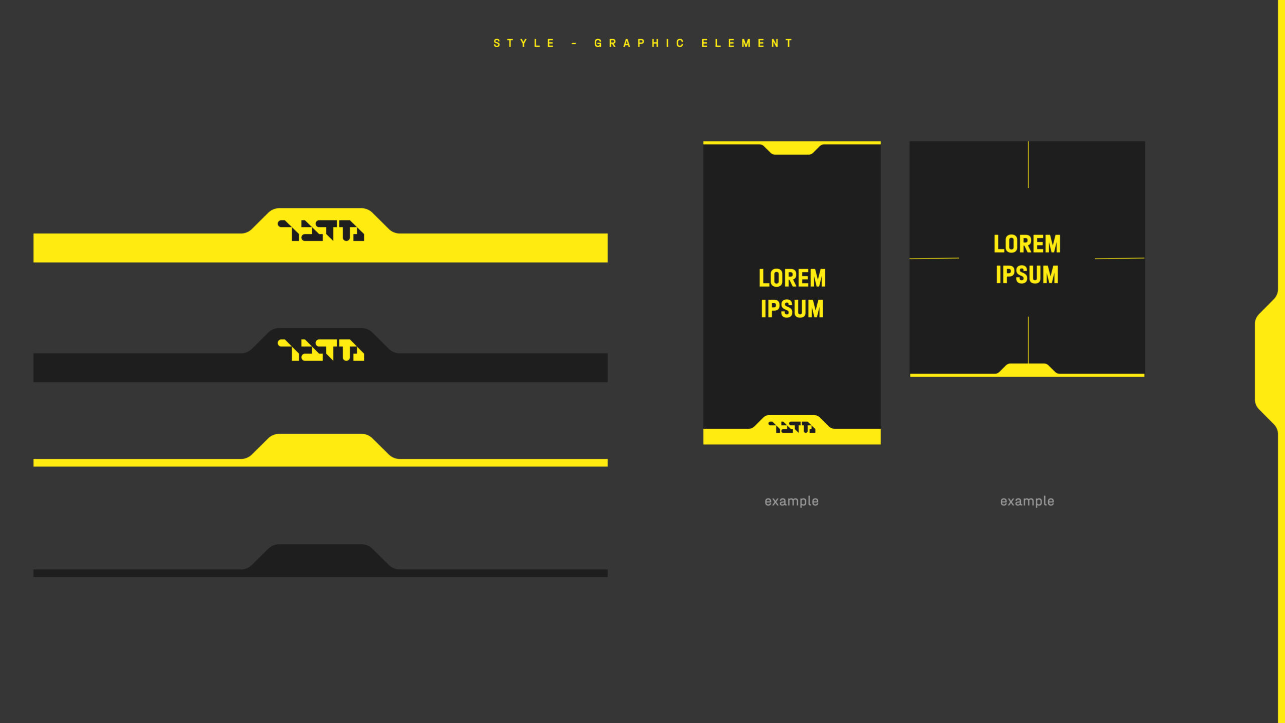
The second step was to work out the style, which we decided to implement in the style of constructivism. This style involves the use of abstract geometric shapes, lines and the transfer of meanings through the language of color and form.
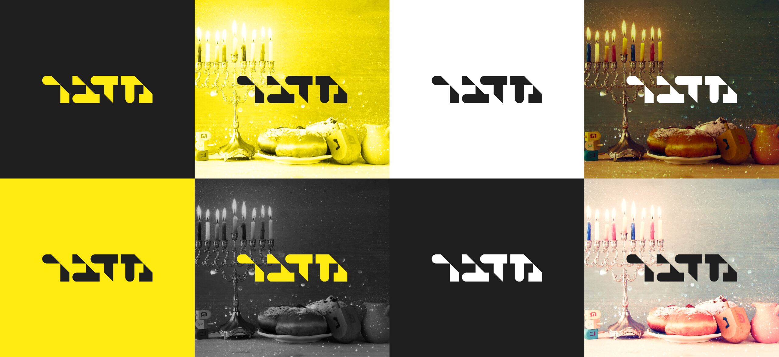
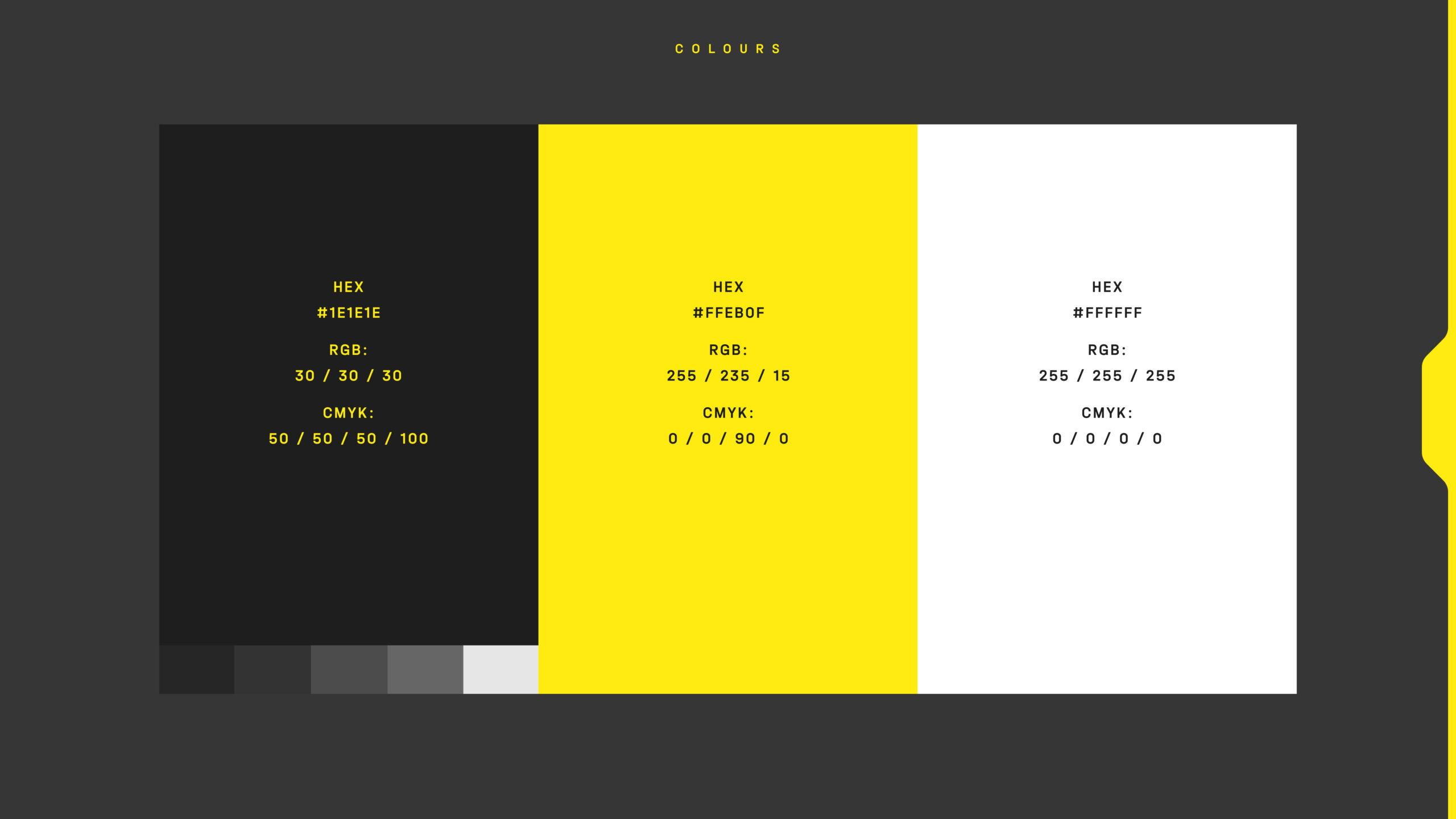
To achieve the intended effect, a strong color solution was used – yellow-black. The contrast between such a palette creates a beautiful color synergy that organically works on perception.
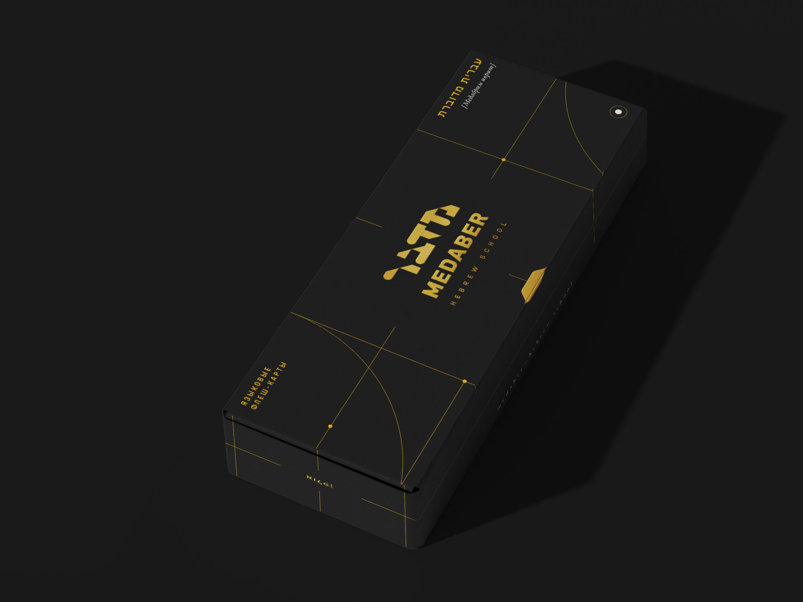
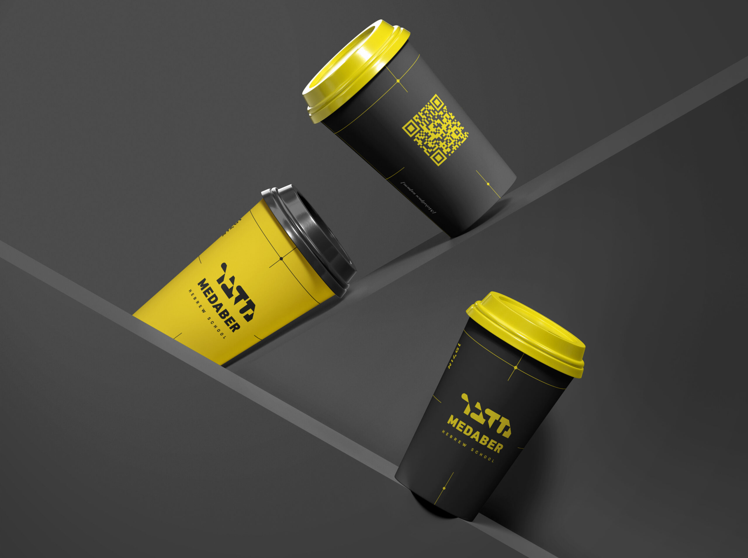
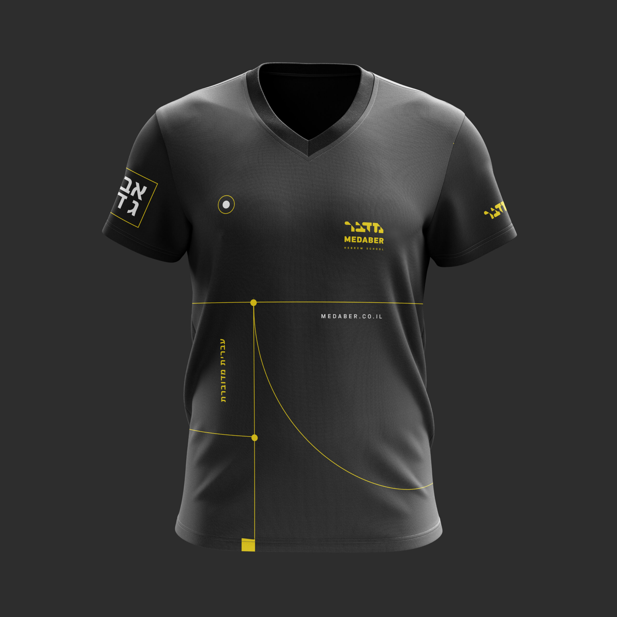
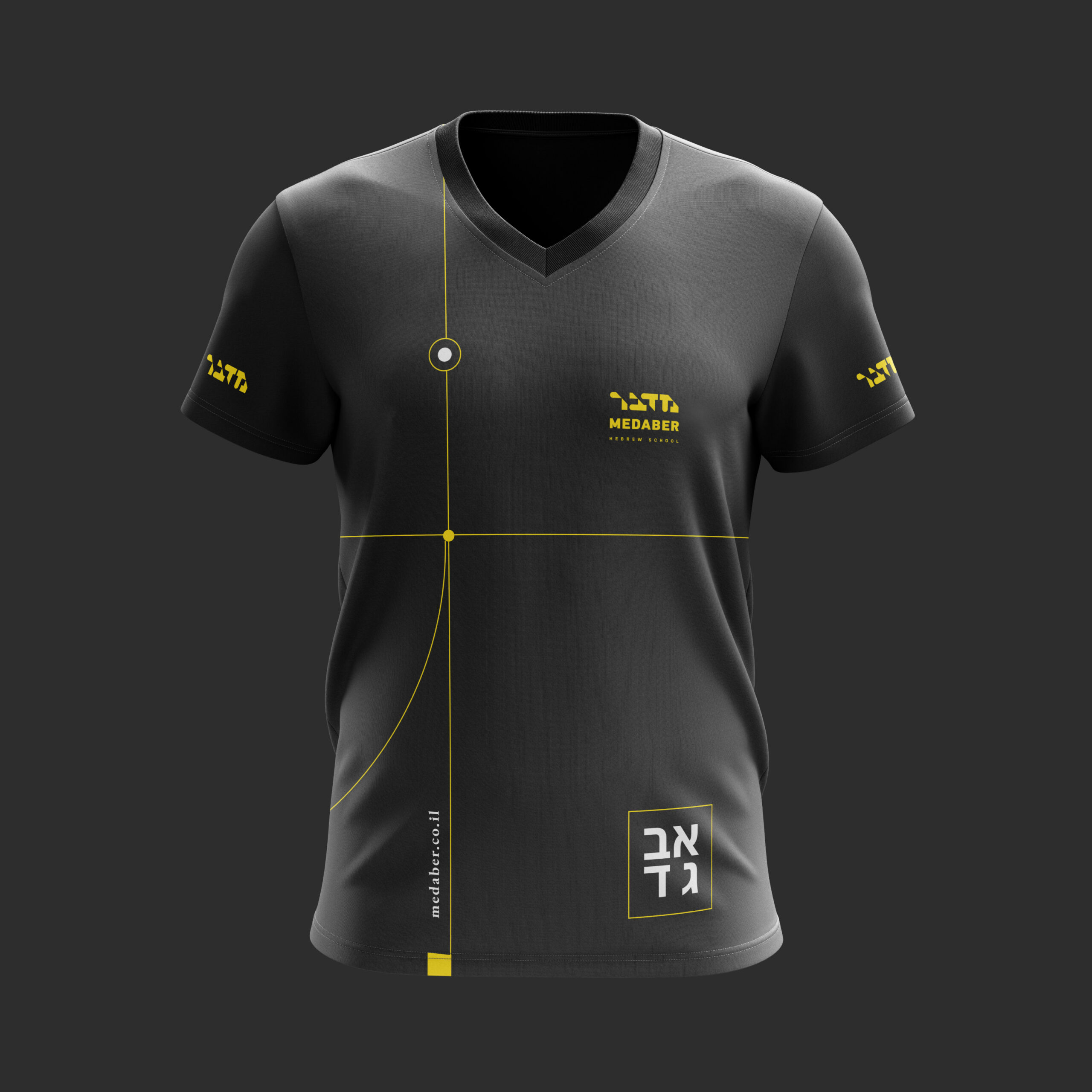
The third stage was the adaptation of the corporate identity to the media. An important factor in a successful brand is its integrity. After all, a well-packaged brand helps to evoke the necessary associations and gain a foothold in the mind of the consumer.
Branded products:
- Educational cards and their packaging
- Templates for social networks
- Programs for teaching staff
- Car branding
- T-shirts
- Thermocups
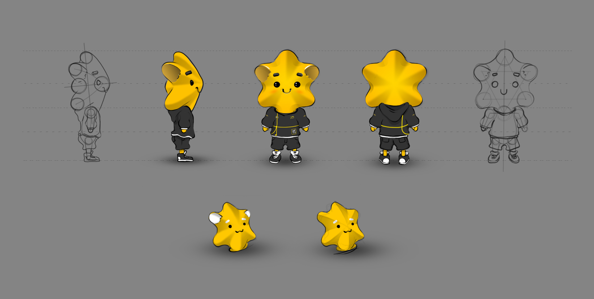
The fourth stage of the project is character development. One of the symbols of Israel, the Star of David, was taken as the basis. A colorful, cartoonish and kind image will definitely attract the attention of a small (and not only) ulpan student and allow the brand to organically and stylishly stand out in a competitive environment.