A unique conceptual space that combines an orthopedic center, sale of children’s and adult shoes, orthopedic insoles, diagnosis of foot problems, massage technologies and much more that allows legs to be healthy.
Rebranding
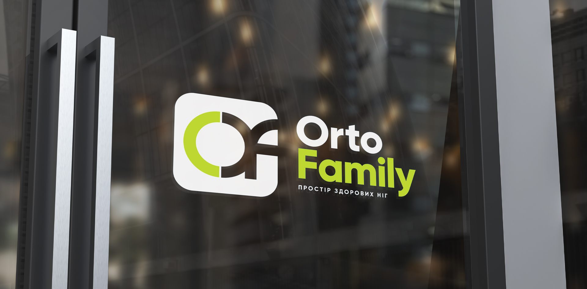
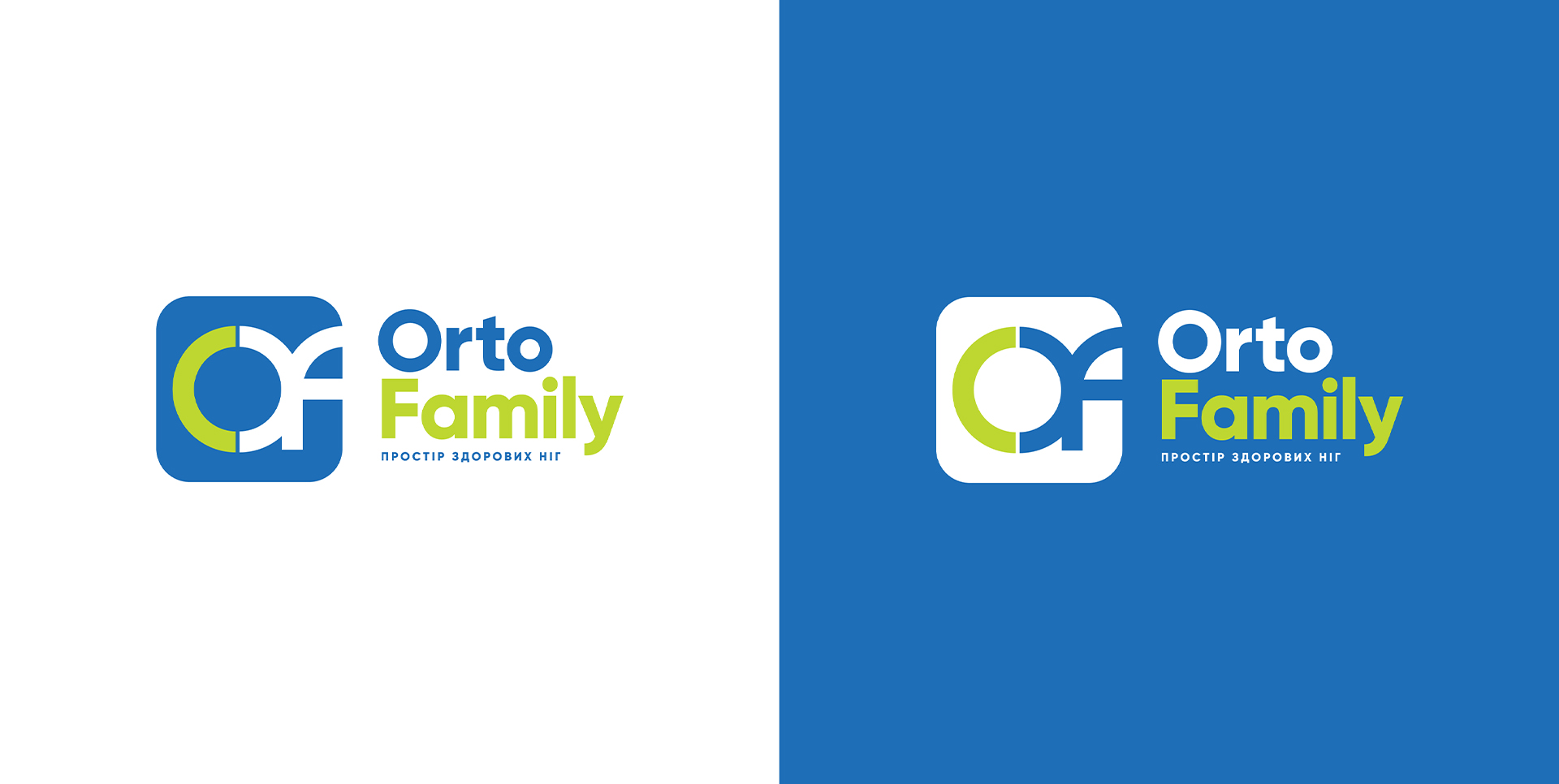
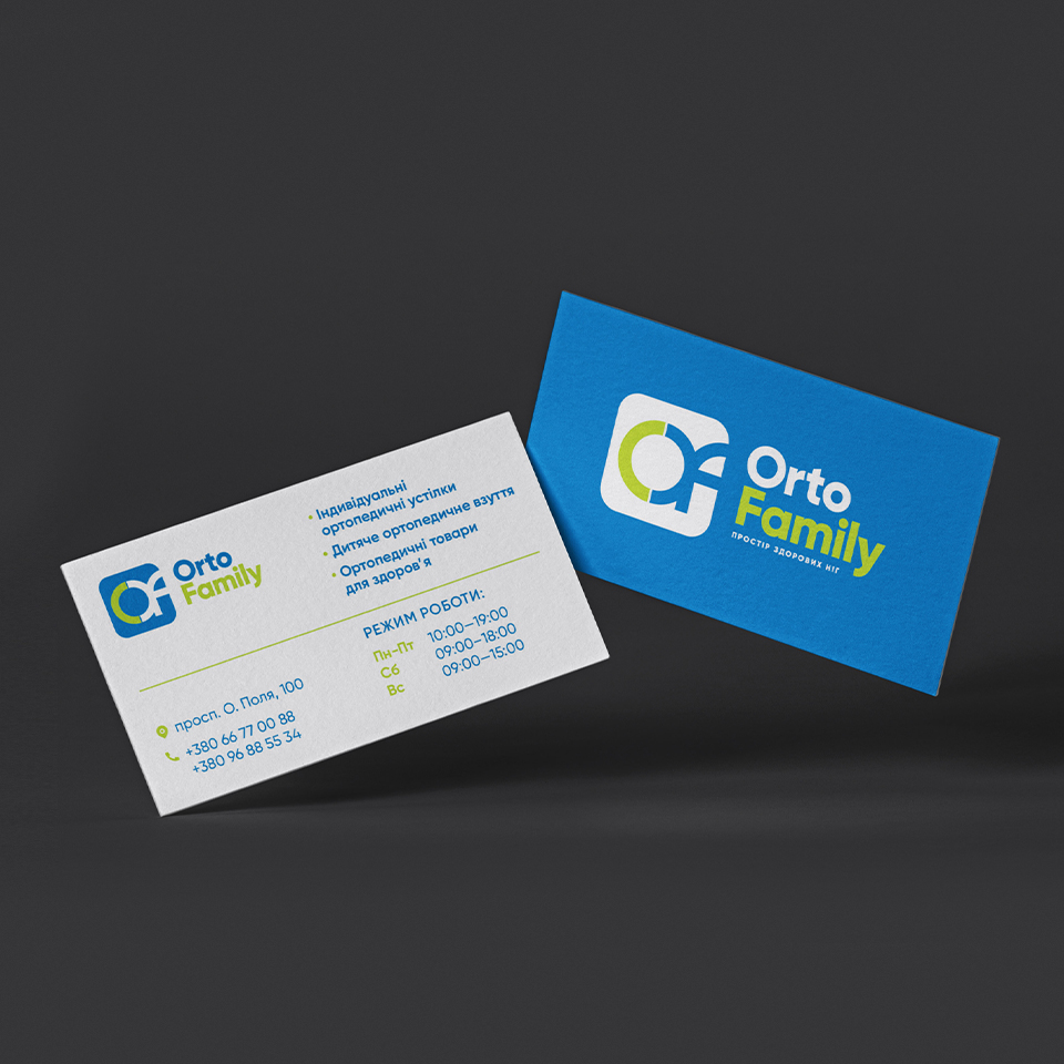
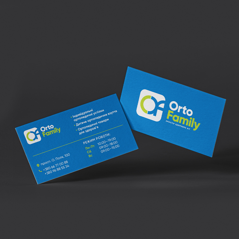
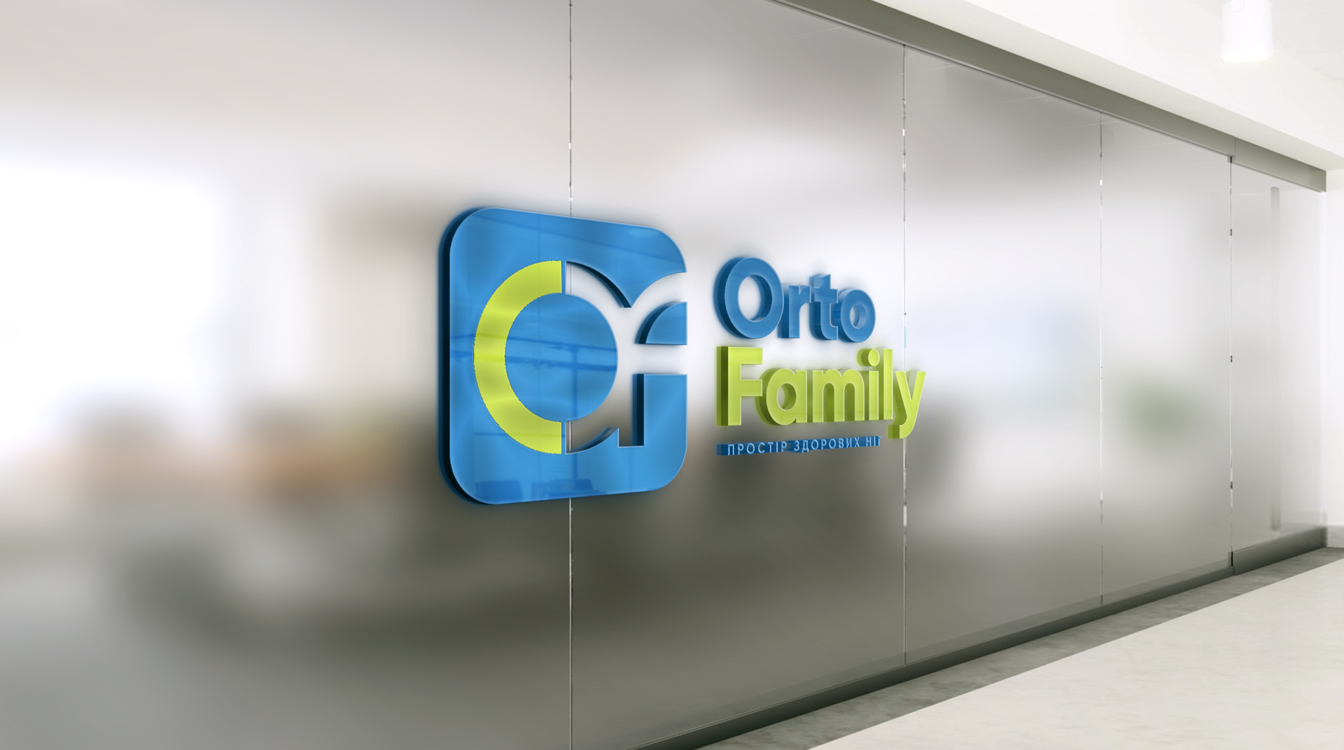
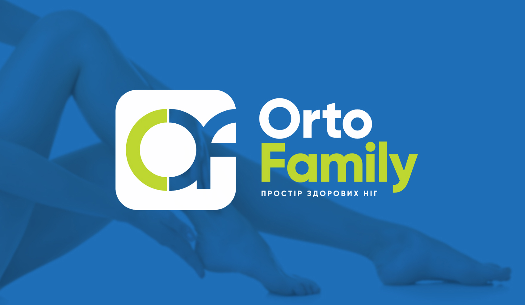
After holding a mini strategy session on branding, placing key accents in positioning, unpacking authenticity, briefing the client, analyzing the competitive environment and understanding the strategy for further promotion of the project, the specialists of our creative studio took the first letters of the company name as the basis for creating a logo
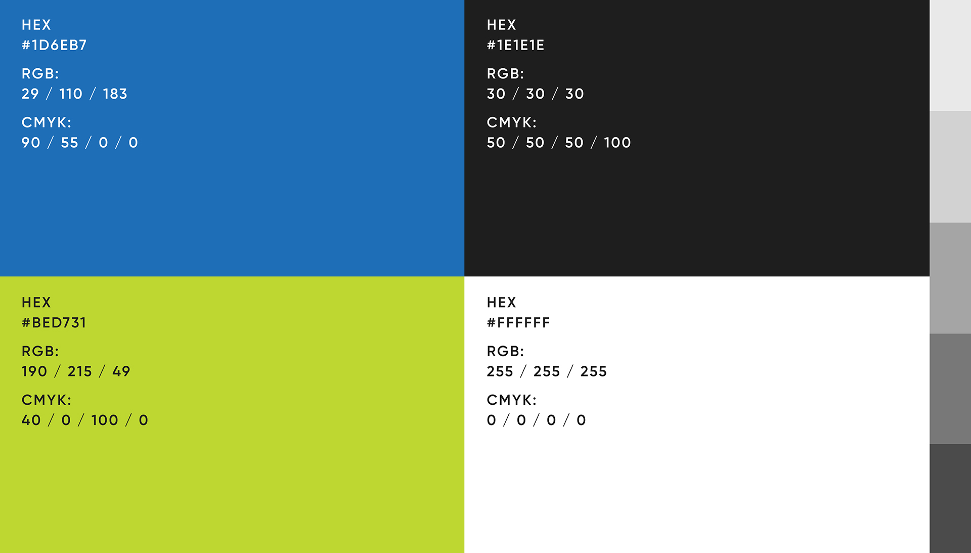
The color scheme uses blue as the main color, which has a very strong psychological value, being the color of conviction. And all shades of green are traditionally associated with our consciousness with health, the environment, as well as with everything natural and organic. This combination identifies the philosophy of the project as accurately as possible
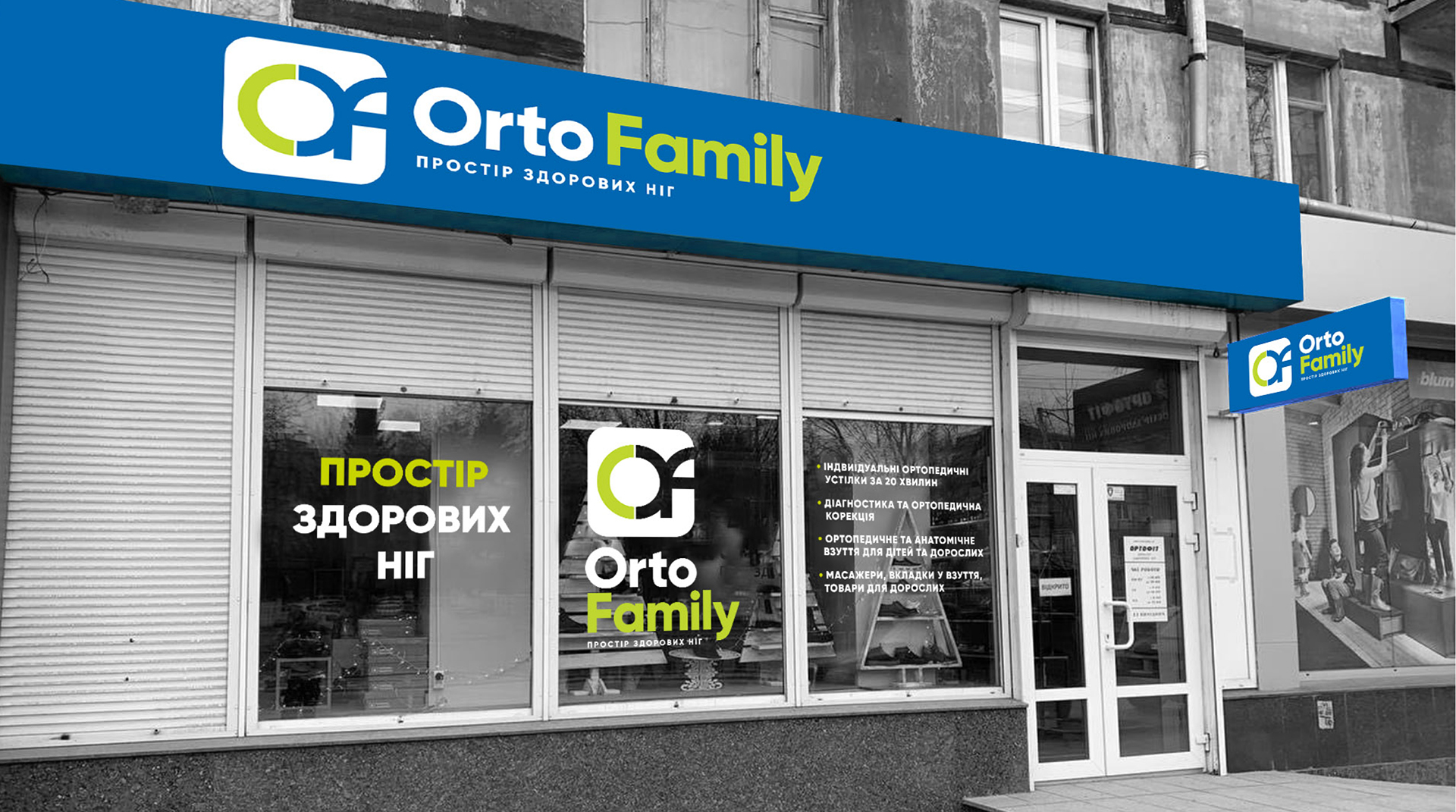
The visual concept turned out to be concise, complete, easy to read and modern.